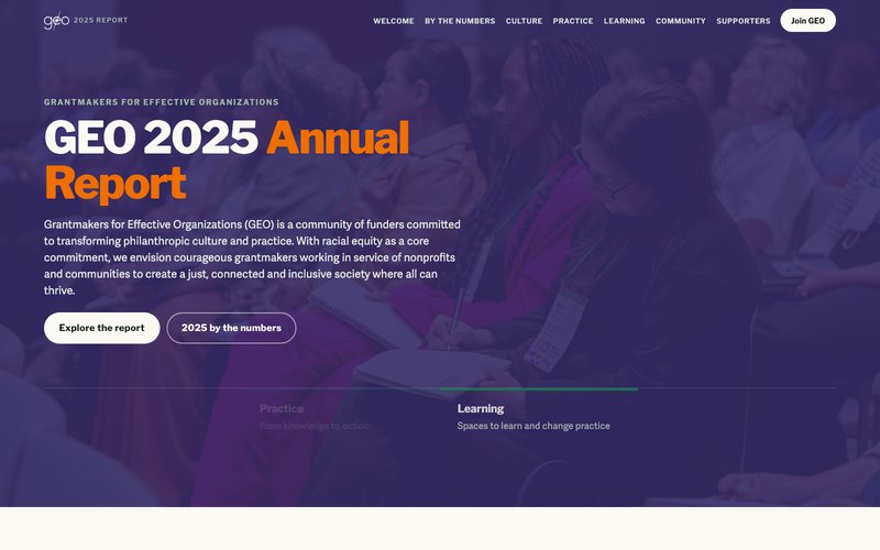
We designed and built the GEO 2025 Annual Report, a scrolling microsite for Grantmakers for Effective Organizations, redesigned from the previous version.
Grantmakers for Effective Organizations is a membership network for funders, and its annual report has to do two jobs at once: account for a year of work to the people who fund it, and stay readable enough that anyone can follow the argument. The 2025 edition needed to carry a leadership letter, a year of numbers, four strategic areas and a long supporters list in a single scrolling page, redesigned and rebuilt from the previous version, without turning into a wall of text.
We handled the complete design and development. The report is organised as eight anchored sections that map to how GEO actually works, with the four strategic areas of Culture, Practice, Learning and Community each carrying their own stories, and a persistent navigation that keeps a reader oriented through a long scroll. We also built it to be read by more people than the previous version could reach: content images that previously shipped with empty alt attributes, including the leadership headshots, now carry real descriptions, the decorative inline icons are hidden from assistive technology with aria-hidden, and the page has proper banner and navigation landmarks that the previous version did not include.
Grantmakers for Effective Organizations, known as GEO, is a membership network for philanthropic funders. Its annual report is the document that accounts for a year of work to the people who pay for it, so it carries a leadership letter, a year of numbers, the organisation's four strategic areas and a long list of supporters. The 2025 edition needed all of that in one place, redesigned and rebuilt from the previous version.
An annual report has a structural problem: it is simultaneously a reference document and a piece of persuasion. Everything has to be findable, and it also has to be readable end to end. Put that on a single scrolling page and the risk is a wall of text that nobody finishes, with the year's actual achievements buried somewhere in the middle.
We handled the complete design and development. The report runs as eight anchored sections that follow how GEO actually works: a hero, a letter from leadership, the year in numbers, an overview of how the organisation creates change, then the four strategic areas of Culture, Practice, Learning and Community, and finally the supporters. A persistent navigation tracks the four areas, so a reader always knows where they are in a long scroll, and the year's headline figures animate into view as counters rather than sitting as static text.
We also built it to be read by more people than the previous version could reach. Content images that previously shipped with empty alt attributes, including the leadership headshots, now carry real descriptions, so someone using a screen reader is told who they are looking at. The decorative inline icons are marked aria-hidden so assistive technology skips them instead of announcing meaningless graphics. The page carries proper banner and navigation landmarks, which the previous version did not include, so a reader can jump straight to the navigation or the main content rather than traversing the whole document.
For a network whose stated commitment is a just and inclusive sector, the report itself is part of the argument. A member skimming for the learning conference numbers and a member reading the leadership letter end to end both get what they came for, and the people who were effectively locked out of the previous version by empty alt text and missing landmarks can now read it too.
This is where a project starts. Every message on this page reaches Pravin directly.